Time. It doesn’t take much time for a prospect to decide to exit a landing page, therefore, the purpose and value of the marketing campaign needs to be very clear in order to increase landing page conversion.
Why Clarity Cannot Be Ignored for Landing Page Conversion
Clarity is the third of seven of Oli Gardner’s Principles of Conversion-Centered Design (CCD). It could arguably be the most important. Clarity communicates the value of your unique campaign proposition to your prospects. Without it, you risk losing their conversion on your landing page and diminishing your success.
CCD is defined by Oli Gardner, Co-Founder of Unbounce.com, as a framework for leveraging principles of persuasive design, copywriting, and psychology throughout the campaign process to nudge your visitors toward a conversion. More information on this subject can be found here.
The Important Role Information Hierarchy Plays on Your Landing Page
The right information hierarchy can help to improve clarity because it helps tell your story. Information hierarchy organizes the campaign information on your landing page in a way that answers all your prospects’ questions in a logical order, making it very clear for them to understand.
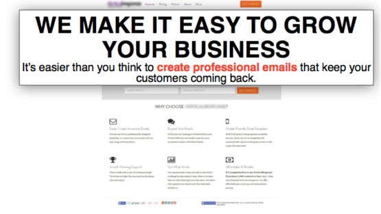
This practice applies to both the literal (what comes first) and visually dominant (what stands out most) elements on a landing page. Take the example below from an unnamed email marketing solution. The bold headline is vague and unclear. It’s not until you read the subhead that you get an idea what the service is about.

Gardner conducted a five second test on this landing page in order to test its clarity and only 6% of the respondents answered correctly (I’ll share more on this test in the next session). When he reversed the headline and subhead, 20% of the respondents answered correctly. It’s astonishing how few respondents understood what the page (and service) where about. Reversing the headline and subhead, in this instance, diminished confusion and made it more clear to prospects what this landing page was about.
How to Optimize Landing Page Clarity for Conversion
In order to ensure your landing page campaign is clear, answer this question: What is this landing page is about?
If you can successfully answer this question, in a very short amount of time, then the value of your unique campaign proposition should be clear to your prospects. Congratulations! This is difficult to achieve but worth the results.
If you cannot answer these questions, you should conduct research and A/B testing. Conduct a five second test on usabilityhub.com for insights and feedback on your landing page design. Or try A/B testing to see where you can make adjustments for improving the clarity of your landing page.
Optimizing your information hierarchy will set you on a clearer path towards improved landing page conversion.
I see how we can improve Solution’s ability to gain audience and capture attention!