Imagine this scenario, you’re browsing the web and see a link that interests you. You click on it and see this:

What are you supposed to do here? There is way too much clutter on this page and no clear direction as to what the visitor is supposed to do.
This is an example of a landing page that has a poor Attention Ratio.
In this post, we will describe what Attention Ratio is and give an example of a landing page that is using it well and one that is not. Lastly, we will provide exceptions to using 1:1 Attention Ratio on landing pages.
What is Attention Ratio?
Attention Ratio is the ratio of the number of things you can do on a given page, to the number of things you should be doing. For successful marketing campaigns, you should only have a single goal.
The Attention Ratio should be 1:1.
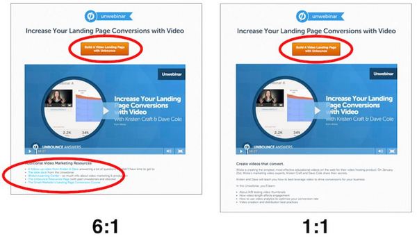
Below is an example of two landing pages, one with a high Attention Ratio and a correct Attention Ratio.
In the first example, the ratio is 6:1. When the ratio is too high, it can create a bad experience for the visitor. It reduces the chance of the visitor to do what you want them to do. The additional links below the image are not needed, if your main purpose for the visitor is to click the Call to Action button or CTA.
If there is one takeaway from this, don’t make the visitor think about what they have to do.

In the second example, the landing page has the correct Attention Ratio, 1:1. As the ratio goes down, the conversion rates will rise for your landing page. It is clearer on this page that there is only one thing to do.
Exceptions to a 1:1 Attention Ratio
If you’re wondering if there are exceptions when you can benefit from a higher ratio, there are two:
- Multiple links/buttons with the same goal: On longer pages, you should repeat your Call To Action throughout the page, so it’s available to trigger an action based on the various content being read. This is fine, as long as each button has the exact same campaign goal.
- When using anchor links in navigation: If a page uses a navigation bar at the top of the page, as long as the links take you to the appropriate section of the page, it will work fine. As long as they aren’t “leaks” that take you elsewhere.
In conclusion, when creating landing pages, never forget the importance of the Attention Ratio. As stated previously, the most important thing to consider when creating landing pages, don’t make the visitor think about what they have to do.