An email or advertisement has managed to grab your attention and also peak your interest. It seems like the product being advertised was made just for you! However, when you click on the provided link, the page you are taken to is a mess of many other links, images, other advertisements, and more. You may have already forgotten why you initially clicked! So where did you go wrong?
You did nothing wrong, but the web designer definitely did. He or she created a landing page with a high aspect ratio.
What is Attention Ratio?
Don’t worry, there’s no hard math involved. As long as you can count, you can figure the Attention Ratio of a landing page. The Attention Ratio is the ratio of the number of things you can do on a page to the number of things you should be doing. On an optimized, conversion centered landing page the Attention Ratio will be 1:1. When you’re taken to a landing page there should only be one link to click on, one form to fill out, one file or folder to be downloaded – one call-to-action. Any other interactive aspects just get in the way of the user’s experience.
Harm Caused by High Attention Ratio
Take a look at the example below. What is the Attention Ratio?

If you said 11:1, you got it right. Imagine coming to this page with the intention of ‘Joining for $1’ and being bombarded with 10 more options. The likelihood of you being distracted, clicking on the wrong link, or becoming frustrated rises. With a high attention ratio comes a lower conversion rate because of all the frustration more than one objective can cause visitors.
Creating an Even Attention Ratio
When you advertise your landing page via email, on social media, as a PPC ad, etc. your pre-click promise must be fulfilled. If your advertisement promises a download of a free ebook, your landing page should only have a download link for that free ebook. It’s that simple! Everything else is background noise – and this noise will distract your visitors.
When talking about Attention Ratio in his video on The 7 Principles of Conversion Centered Design Oli Gardner only gives ONE instance for having more than one link on a landing page. He cites e-commerce landing pages with upsells as the only time additional links may actually benefit conversions. So if visitors like the product being sold on your landing page they may also like other products you have to offer. But remember to keep the originally advertised product dominant on the page so that other links to cause visitors to lose focus!

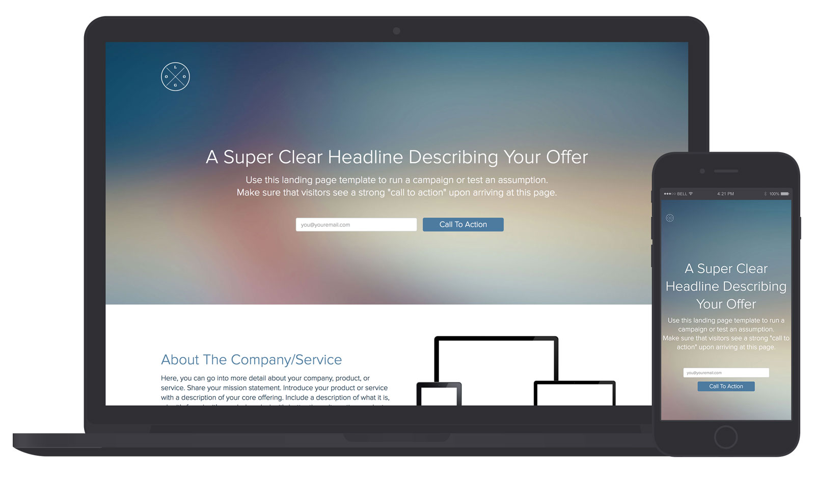
Ah, the perfect Attention Ratio! All you do is enter your email and click the call-to-action. There’s nothing else to distract you, nothing else to fill out, and nothing else to download.