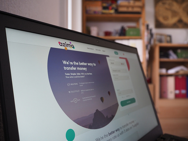
What makes a landing page successful?

[Note from Ross: This is part of a series of blog posts by Lindsay, a student in our MKT513 Digital Marketing Masters Class. She’s documenting what the course is like from the student’s perspective. She received a partial scholarship in exchange for her blog posts about the course.]
Our Digital Marketing Masters Class met this week to talk through best practices for landing page design. A landing page, for the purposes of this discussion, is the first page a person visits when coming to your site. And while we’ve all seen beautifully-designed landing pages, looks aren’t what makes a landing page great — The true measure of a landing page’s success is its ability to generate conversions.
How can your landing page make visitors convert?
There’s lots of advice out there on designing a landing page — We covered some of the most popular design principles during our discussion and through our conversation, some of the most immediately useful concepts quickly emerged.

The first question your landing page should answer
Conversion optimization expert Oli Gardner has one basic question every visitor to your landing page should be able to answer within seconds: What is this site about? To find out how quickly your site answers this question, ask! Ask friends. Ask colleagues. You can even ask strangers through a site Gardner recommended, called Usability Hub.
As a class, we found this question very helpful when we critiqued actual landing pages. We realized through our own experience that the longer it takes a visitor to figure out what a landing page wants us to do, the more likely we are to click away from it without taking action.
More helpful tips on maximizing landing page conversions
Three more questions your landing page should immediately answer for visitors:
- What are you offering?
- Why should I pick you?
- What do you want me to do next?
Again, by looking at actual landing pages, it became clear to us in class that the sooner a landing page could answer these questions in our minds, the more likely we were to engage with the site — and convert.
Digging deeper into great landing page design
Now that you’ve covered the basics, you’ll definitely want to check out Oli Gardner’s 7 principles of conversion-centered design. These principles will help you analyze every aspect of your landing page and maximize its ability to convert.
A few landing page tips from site users
Our classroom critiques revealed that from a user perspective, some landing page design tips stand out more than others. Here’s what we cared about most when we looked at an actual landing page:
The landing page’s call to action needs to be plainly visible above the fold.
A surprising number of landing pages require the user to scroll down in order to figure out what we’re supposed to do. Not cool, dude.

Distractions are… distracting.
The more distractions there are on a page, the less likely we are to pay attention to that call to action and convert. Eliminate as many distractions on your landing page as possible and you’re more likely to have our full attention.
Credibility matters.
If you’re offering a product or service on your landing page, we need to know you’re legit. A Better Business score is good, and so are links to your social media platforms. Most of all, we love being able to see actual user reviews of your product — and if you offer a service, we’d love to see a link to examples of your work and client list on your landing page.
Think about these tips as you’re designing your next landing page and you’ll be well on your way to meeting and exceeding your conversion goals. Good luck!